As far as responsive web design is concerned, testing is one of the most crucial aspects of this truly complicated process. It's not just about writing the code and figuring out the layout and the design, but you also have to be adamant in your strive for perfection by constantly testing the product again and again and looking for flaws in what is otherwise a perfect symphony of mathematical precision.
Indeed, the process is difficult, but there are lots of tools to help you along the way in this inexorable march towards a flawless product. It is in the irrevocable nature of the responsive web design that you have to always be on your guard and not let your guard down even for a second, otherwise mistakes might be made that will put your whole project in jeopardy. Fear not, though, as I will present you with some of the most useful weapons to combat those dire eventualities and forever detriment the rise defects and imperfection in your work. If perfection is what you're after, then you will definitely need some of these tools.
Respondr

Invaluable companion to anyone who is searching for anomalies in one's design, Respondr is a pretty small and easy to use tool. It enables you to check the results of your work through the eyes of various devices without actually having to own those devices. Have you got the dimensions right? Are the pictures displayed properly? Is the site loading with a regular speed? Answer these questions and more with the help of this little gem. Just paste the URL of the site you want to test and then pick the setting of the device and viola – you're done! It's a truly amazing yet unimaginably simple tool, but you know what they say – everything genius is simple.
Viewport Resizer
In a pretty similar fashion like Repondr above, VR enables you to copy and paste the URL of the site you want to test and the settings you want to test it with. This little program has more variety in options, though, as it lets you go from a small smartphone to an HDTV and even though I doubt most people use their 49” plasma to browse the web, when you are after perfection, then you are not allowed to make any compromises, even if it's a huge improbability that anyone will ever see your site in this manner.
Responsivator
You already know the drill – enter URL, pick dimensions of testing. If you're already getting a sense of deja vu, you should – you've already seen it. But of course you, these tools are similar and have the same functions using the same methods – what did you expect? Still, there are small differences between all of them. In this case the difference comes from the fact that this tool lets you also use a custom resolution or screen size in order to test it, which is pretty neat if you're trying to pull something interesting and truly creative.
Screenfly
Guess what this tool does. If your answer is “creating a virtual fly on your screen just to annoy you or scare your girlfriend”, then you haven't been paying much attention to the article so far. It lets you enter a URL to test a site, choose the dimensions you want to test and also enables you to share a custom link with others to test the site, which is what makes it different from the other programs or applications in here.
Well, you can choose one or more of these to test your site and create something truly beautiful and unique. Good luck!
About the Author:
Rose works as a web designer at http://www.perfectcleaning.org.uk/end-of-tenancy-cleaning-stoke-newington-n16/ she has a lot of experience and loves to share it.
|
11/11/2013 | Continue Reading...
Web designing is a very complex process wherein it needs a set of skills and a certain amount of discipline to produce, maintain and run the website.
Now that with every passing day a new phone or a tablet is being released creating a new website for every other resolution is not advised, and in most cases is not the solution. The best option is to create a website that is user friendly, and one which has the most graphical content in it, also make sure that the designs are responsive. The website should have a catchy slogan and a new way of experiencing the web all together.

Many leading social networking websites have rich graphics. This brings with it a lot of excitement for the new user, and also to the ones which are already there. These websites depend on their web designers to come up with designs that intrigues the user, this is because, and the owners of the website know that, for any website to run they need their designers to keep altering it, not so much that it misplaces its main purpose.
Website owners know that this is possible only when they have a good team of web designers in hand. Basically the job of these web designers is to come up with fresh new ideas so that the website does not lose its place it the listing and predominantly not its users. For example Facebook comes up with a whole-lot of new things which improve the usage of the website. This keeps the users (us) hooked on to it.
Usually, website consists of web styles and web content. These days, in this aggressive web world web content brings more requirement and it comes through all over the globe. These days, most of the people began understanding the need of the web style and using it. Hardly web content become more essential and important for every web experts who manages websites. Web content provides well developed and visual website to the web visitors and also for the web experts. Web programing are done by the web developers and if they design the site well, then it can be said that the website brings more provides from the clients as well as more priority among the visitors.
For good graphical content you need two types of people: Web designers and web developers. Mainly, you need a good team of web designers who are good in motion graphics, because the thing that catches your eye the most whenever you are going through a web page are the motion graphics, and another good team of web developers. These teams’ works together to make sure that you have the best web page possible.
Web styles can be designed using effective web developers and he may use more program such as CSS, HTML and many other types of 'languages'. Every web styles designed by the web developer should be lightweight and the web style designed should be organized has it is simple friendly and quickly simple to understand to the web visitors. When appropriate web developing is done for the website, then the particular website brings more visitors among the web visitors as well as the web developers come up with more reputation among the individuals.
To ensure that you have a good web page you need a fair amount of web developers and web designers, these people will make the page as user friendly as possible. They will first take your concept and work on it, developing ideas which are fairly new and with that they start building the website. These teams will plan the, it depend on their web designers to come up with designs that intrigues the user, this is because, and the owners of the website know that, for any website to run they need their designers to keep altering it, not so much that it misplaces its main purpose.
● Page layout.
● Motion graphics.
● Code.
● Typography.
● User experience.
● Interactive designs.
After planning all this, these teams will do their respective jobs for the better outcome of your web page. This process can take a while meaning week’s months and even in some cases years. You have to keep your cool during this period but must always keep a track of the progress. Also make sure that you make all the members in every team sign an intellectual property agreement, so that your idea stays with you. So web design is considered as an important aspect for all who maintain a website for their business.
You can visit www.themusicase.com for some of the best graphical content examples.
About the Author:
Julia is an Avid Blogger from Manchester, UK with 5+ years of experience in blogging. She is interested to learn new things. As of now she is focusing on Sky Contact Number which provides information regarding digital satellite TV and radio service.
|
10/16/2013 | Continue Reading...
More and more computing is going virtual. The advantages offered by hosting data in ‘the cloud’ is so great that uptake of cloud storage and virtual servers show these are set to become the norm. It’s easy to see why when you look at the advantages of virtual servers:
1. Low capital expenditure. There’s no need to buy expensive equipment. And virtual servers are generally utilized at 80% as opposed to the 5-15% utilization of physical servers so fewer are required.
2. Improved efficiency
3. Less risk of downtime as virtual servers quickly divert traffic to a working server. This saves the cost in the form of losses often associated with downtime
4. Quick deployment of new servers because there’s no need for physical changes
5. Saves energy, which means lower costs and benefits the environment.
6. Opens opportunities for cloud computing
7. Ability to continue using outdated software which would normally become incompatible with modern hardware.
So if all these advantages are generally available with any virtual server what’s the difference between different virtual servers and which are the best?
VPSnine VPS256 virtual server

Basic linux virtual servers are perfect for small businesses that have minimal requirements in terms of storage space, bandwidth and processing power but still want the benefits of a virtual server.
With the VPS256 you get 10GB of hard drive space, 300GB bandwidth speeds, 256MB of RAM which is also supplemented by 384MB of ‘burst’ RAM to cater for a sudden increase in traffic. All these numbers sound very low, especially when compared with some top of the range virtual server offering but for only $10 a month you can’t argue that it’s a very low cost solution that fits in with small business demands well.
As mentioned virtual servers can be implemented and ready to almost immediately. The interface is user friendly with over 25 Linux operating systems to choose from.
VPS.NET
VPS NET has both US and UK bases. The bandwidth promise is the most beefy part of their offering, in fact your disk space and RAM allowances are comparable to cheap super market burgers buns around a premium chuck steak beef burger i.e. measly in juxtaposition. However if high broadband speeds are the most important thing to you then this is the right niche product. There’s 1 terabyte broadband meaning super fast network transfers. The uptime is also very impressive at 99.99%. Despite only 376MB of RAM the other impressive features makes the $25 a month price tag a bargain for the right customer.
HostGator
Environmentalists who value wind power will love this. HostGator has a wind energy source that generates 130% of the power needed to run the servers.
You won’t be tied into a long contract either as HostGator operate a rolling contract month by month. Like most other hosting companies there are a variety of packages which HostGator allow a lot of flexibility on. Depending on your needs they’re able to offer both VPS hosting (idea shared virtual server hosting) or dedicated hosting meaning that only you have space on the physical server.
InMotion
InMotion is a top pick for me because you get low cost hosting with the option of two physical locations for your virtual hosting. This means enhanced security because if there’s a disaster at one location your hosting will default to the other location seamlessly with little to no downtime.
Like HostGator you have the choice of sharing hosting space or securing dedicated and private servers. Additionally the user experience reported is really positive. Use the basic functions easily or optimise the interface to making advanced tasks a cinche.
SharePoint Server 2013
Most people will have heard of SharePoint and some may have their opinions of SharePoint products. The SharePoint Server 2013 is a little different to other servers I’ve been talking about as in this case I’m referring more to the front end functions that users actively interact with.
SharePoint is a sub category of Microsoft and is in essence a virtual workspace for fast communication and collaboration. It can handle enormous amounts of data easily. There’re handy apps to aid productivity and keep work flows on track.
The system is ‘scalable’ meaning you can start out with basic business functions and add to or take away from the environment’s capabilities and architecture. So if you have workers who need to work together or view the same information but they’re physically remote SharePoint solves that geographical issue simply.
It’s worth looking into virtual server backup solutions too in order to ensure the absolute security of your virtualised environments and back up of cloud stored data.
|
7/25/2013 | Continue Reading...
Web design is one of the most important elements of your website and ties together aesthetics, navigation, and content to create an effective experience that encourages greater conversions. There are plenty of web design guidelines to keep you on your toes and create something that maximizes usability and aesthetic appeal, but one of the growing online trends is responsive web design. What is responsive web design, and what can you do to make it work on your site?
What is Responsive Design?

Responsive design is all about flexibility, adapting to changes in the environment, and predicting how a user may use a particular page. It came as a response to the growth of hardware as people were browsing less and less on desktops and laptops and more on smart phones, tablets, and other devices.
In the beginning, sites only had one design over all devices. You can imagine the difficulty that comes with navigating a full desktop site on a much smaller mobile device. Over time, developers and web designers realized that mobile versions of their websites were a necessity. It wasn’t exactly forward thinking, but it was an effective solution at the time.
So developers had two versions of the site, one for the desktop, one for mobile, but what about touch screen tablets? What about large, hi-res displays larger than normal desktop screens? Developers had to address the changing scope of web browsers and how they were used in a more concrete way. After all, they couldn’t create seven different versions of the same site. Hence responsive design.
Fluid Grids and Media Queries
“Fluid” really is one of the best words to describe responsive design. Traditionally, sites had fixed-width layouts. Page designs have a specific number of pixels across with the content centered on the page, which becomes a problem when you consider the different screen sizes and resolutions out there.
Fluid grids do away with the concept of rigid pixels and percentage values. In a fluid grid, all of the elements in the layout resize themselves in relation to one another, resulting in a site that looks fine on a big screen or a tiny mobile phone.
However, a site’s design can look horrendous if you narrow down your browser size enough. The solution: media queries. Media queries allow you to gather data about a visitor to your site and apply specific CSS styles. If, for instance, a visitor is browsing on a mobile phone, the site can automatically move navigation bars, remove unnecessary elements, or shrink down the three column layout into just two.
Switching Mindsets
To implement responsive design, you have to change your mode of thinking. While there’s nothing wrong with having a dedicated mobile site based on your business model, responsive design is less about isolated, device-specific sites and more about considering the viewing and browsing context. It’s about considering different user experiences and adapting accordingly.
If you’re considering implementing responsive design into your website, this responsive web design article is a great place to start. Good luck, and remember the advice of Bruce Lee when it comes to design. Be water, my friend—let your design flow with the many technological changes we’re bound to experience in the future.
|
7/11/2013 | Continue Reading...
Every web designer whether he knows SEO or not, should know how to design a website that is completely SEO friendly. This article shares the design tips that should be implemented throughout the web design process.
For any web designer it is very easy to code the most complex of designs and forms but when it comes to SEO friendly designs these brainy people just seem to get confused but no need to worry anymore because this article will help you clear any confusion. Some of the tricks and tips shared below are ones which a designer is always told to take care of but some designers may not know anything about. So continue reading further to know what needs to be done while designing a perfect SEO friendly website.
Coding Errors

This is an expect of web design that all designers should know but it’s often seen that the designer skips aspects to fulfil the clients design needs. Web design is not easy and it can take a long time if the expected results are complex and complicated. To make things easier its important to keep the whole design divided into sections. Also, these sections are sometimes allotted to various designers in a team which leads to a variety of coding. All designers do not design the same way so it could happen that while one designer is neat in coding the other might be more focused on getting the results instead of keeping the code clean. So whether you are designing with a team or operating solo, make sure that no extra open brackets or commas are left without reason in the website code. Also this helps to get fewer errors during a W3C Validation Check.
Managing Files is The Key To Design Success
The number of files is directly proportional to the number of pages to be designed for the website. For every webpage designed there are at least 3-4 more pages containing important details and codes that help the final webpage run successfully in a browser. Such files are also called as the supporting files. Thus, it is highly important to manage all the related files properly and correctly. Also, you must make sure that each of these files are named correctly. Having a well managed site is helpful to any SEO professional looking to optimise your website. It is very difficult for non designers to search for files that need to be edited for proper on-page SEO. Search optimisation specialists rely on the file names to be well organised, but if this is not the case then it will simply increases work load for your SEO specialist. Another important thing is to delete all files that are of no use this will increase the loading time of your web pages.
Creation of Robots.txt
Robots.txt file is a very important file that a web designer should create along with the other files. This is the first file that a search engine’s crawler looks for in any site. This file tells the crawler about the pages and files it should crawl and the ones it shouldn’t. Also, it is best if the designer creates this file because who else would know better about which files need to be hidden from crawling. Also, recently a trend has emerged of placing the link of the XML sitemap in this file.
Create Sitemaps
Any site must have two kinds of Sitemaps, one which is meant for the search engine and one which is meant for the audience. The normal extensions of these files are .xml and .html respectively. Both of these files contain the same data, only the representation and the usage vary in both.
Hence these are the ideas that you should either implement or create for making a website completely SEO friendly.
About the Author:
Danny Nevill is the owner of Universal Web Design which is an affordable small business website design service provider. The team at Universal Web Design are a blend of efficient web designers and internet marketers. No wonder that their clients are always pleased. Always choose an internet marketing agency over a general web design company.
|
7/10/2013 | Continue Reading...
Most of the website owners prefer using the Drupal hosting platform as it is based on an open source technology that enables better efficiency. Drupal is mainly used for creating new websites and distribution of the content over the internet. Drupal is known for its speed, diversity, and dependability. In order to get the complete advantage of Drupal, it is also necessary to select a good Drupal hosting plan.
Here's what to look for in an efficient Drupal hosting plan:
Cost

It is crucial to consider what kind of resources are being provided in a particular cost. Before you sign up for a Drupal hosting plan, it is very important to perform a cost versus benefits comparison of the web hosting companies that you have shortlisted. While comparing the costs it is also important to consider the resources and technical assistance provided. The Drupal hosting plan should be considered as an investment rather than an expense. It's also important to find out the server specification details on which Drupal sites are hosted by the hosting provider. A low specification server may degrade the performance of your website.
Security
It is crucial to have a secure website. The hackers and identity thieves don’t really limit themselves to one individual. Make sure that the web hosting company that you select provides you with complete security and backup features so that your website is always safe. You must ensure that proper protection is provided, otherwise this may affect your online business.
Compatibility
The web hosting company that you select must be able to accommodate the diversity of your website. Make sure that the web hosting company has the expertise to manage the current framework of your website. Make sure that the web hosting company you select enables you to host on Linux/Windows operating system. Easy upgrade options should be available.
24/7 Support
The Drupal hosting company you choose should provide 24/7 expert support through live chat, email and phone. The hosting company should not charge additional fees for troubleshooting any kind of support and server related issues. You may skip the hosting providers who are available only during business hours and week days. In the event of migration to other hosting provider the current hosting provider should assist you with the migration process.
Money Back Gurantee
Consider the web hosting provider who is offering minimum 30 days money back guarantee. Utilize this period to test the support, service and performance of your website. The hosting company should offer full refund if the support and service offered does not meet the expectations. Some web hosting companies also offer upto 45 days to 60 days money back guarantee.
Downtime
Nothing kills a website faster than a chronic downtime. The website users have short attention spans. If you have a slow website, the users will immediately switch to some other website. Before you sign up for Drupal hosting plan, make sure that the web hosting company offers a good uptime for your website.
Make sure to consider the factors mentioned above before you select the Drupal Hosting plan. There are various other factors you have to consider before getting into any web hosting plan, however even if you consider the ones mentioned above you will surely make a good investment.
|
7/09/2013 | Continue Reading...
When you are launching your website on the World Wide Web, you are investing your time, money into it. A lot is riding on the website’s success. Therefore you need to make sure your efforts are channeled in the right direction. One key aspect of a successful website is its design. Web design is not just about the appearance but also the layout of the site and how the contents of the site are organized. Often you will find sites that are real flashy looking but have no substance in them. Then there are sites that have good content but are really bland. So it is about striking the fine balance between style and substance. For that the best bet is utilizing website design by Creative Yogi.
Benefits of Custom Web Design

To make your presence felt online, it is almost essential to have a custom design for your website. A well executed custom design will not only help to bring in new visitors, but will also properly highlight the products or services that you are offering to the customers. Keep in mind that if you want a site with an effective professional look then the only realistic solution is custom website design by Creative Yogi.
Here are some additional benefits:
1. Because the site has custom made design, you can add plug-ins and modify designs even after the site has been launched. You can add an element of freshness in the site from time to time.
2. When your site boasts of eye catching design and quality content, it will be easier for your product or service to grab the attention of the visitors.
3. You will get custom web designs at a reasonable price.
Points to keep in mind while doing a custom design
1. Have an easy navigation system- An easy navigation will make visitors happy. This is one of the biggest aspects of a successful site. It ensures a smooth experience for web browsers. A poor navigation can irritate them.
2. There should be a master link to the homepage that users can click anytime. It will be even better if that link is attached with the sites logo.
3. Another important thing to add is a site map. It will help the visitor to figure out the layout of the site covering the menus and submenus.
4. A smart, clean professional look will instantly make the site credible to the user. It can be achieved by using appropriate color scheme, tasteful backgrounds, right font size, graphic designing, content etc.
5. You need to make sure that the pages of the site load without much delay. If it takes too much time the user will be unhappy.
6. You must add new content in your site from time to time.
There are many web designing companies these days. But you should not hire one randomly. You would not want a stock design for your site but that is exactly what most small web designing firms do. You need a custom design for your site that will amplify the strengths and hide the weaknesses.
About the Author: Raju K is has extensive experience in the field of multimedia and web designing.
|
7/09/2013 | Continue Reading...
2013 is the innovative year for the web designing and development year because the mobile phones, tablets are used by us each and every day and browsers are faster than ever before. These create more option and opportunity for developers and designers to do some innovative and reach to large amount of visitors. Till 2012 we have just seen the simple design and CSS that is not reliable on mobile phones and tablets.
We are hereby described some next generation that is widely used after 2013 and have been using after ever.
Development Side-
CSS3 Menu and HTML5 Programming

CSS stands for Cascading Style Sheet and it is used for decorating web document but the next version of its CSS3 is a new flash element and used for adding animation property and many other facilities or elements that make web document attractive and no any extra cost like size, page speed etc.
Same as above the HTML5 is the newer version of HTML launched by the W3C and used publicly in 2011. It gives developer to browser compatibility and it impress more and more by its new features added by W3C like canvas, movie, article and more dynamic web element.
Ajax and HTML5 “on pop” Bonding state
The HTML5 onpop state change the URL without reloading the page that is quite interesting. By this feature of HTML5 allows developers to navigate from content to content instead of page to page. Just the frame is changed not a page. This facility saves the server request/response time and increase page speed nearer about 20-40% and there is not any issue regarding the Google crawling.
Design-
Responsive and Adaptive Web Design
These techniques are currently most popular and cost effective solutions to solve problems. If you have a mobile site then it is not good enough, it may create an issue regarding duplicate content and also web popularity. These trends allow you to keep one site content for every equipment.
Typography and deliver content on Heavy Design
Before a few years ago web designing was growing towards apple-esque and ultra-glossy design. Now everyone has a smart device like the iPhone and iPod in hand from a small child to 80 year old lady. The web designer should have to deliver content on such type of latency devices. That’s why the word Typography, subtle patterns, clean lines coming in web design world.
Mobile Touch Screen Design
The newly web design trend is the Mobile touch design. Hover elements are out and big buttons are in. One cannot use hover on the tablet or mobile devices. For these devices navigations are not done by mouse pointer but by swiping or tap it. It can access or utilize by swiping, clicking and many other touch related elements. Simply Swipe, tab and click it.
Summary:
In 2013 mane new thing arrive in web design & development are: CSS3 menu and HTML5 Programming, Responsive and Adaptive Web Design, Typography and deliver content on Heavy Design, Mobile Touch Screen Design and many more. With the help of these you can give a new look to your website.
About the Author:
I am a writer and web designer at zylone from Singapore. I also like to write about new resource, features and trend related articles.
|
6/20/2013 | Continue Reading...
As most webmasters begin to build their business’ presence on social media pages like facebook, they often have one simple goal: to drive people to their website. While this is the undisputed goal of almost any online marketing effort, it doesn’t mean you can’t also consider SEO when working the benefits of things like social media. Every time you make a choice in your facebook page to promote something, or drive traffic – you’re engaging in SEO; whether you realize it or not. Let’s take a look at some of the basic ways you can get some SEO leverage out of your social media, even if it’s not your main goal with the channel.
How are SEO and Social Media Connected
Any time you create a post on facebook that promotes your products, services, or any part of your website – you’re creating a call to action. This call to action can be as simple as “visit this page”, or as complex as “read this whitepaper”. Either way, the end gratification of the user is going to determine how much they share your content. While this sharing will often happen on social media pages, it will also happen organically online in the form of links. As we know, links are major SEO currency – and you want them! Therefore, if you are trying to move the natural ranking of a product page; you might as well promote it in facebook. If it’s a product that will make you money anyhow, and will convert well there – go ahead and get some potential SEO value form the action as well. Why not take the opportunity to promote a page your trying to grow ranking for, rather than an equivalent page that would also convert well?
How to get started

Just as you might create an SEO strategy plan with incremental page launches, and devoted timelines; so should you adapt this to social media. Architect your posts for engagement, and revenue – then schedule those based on the landing pages and keyword terms you want to move across the same time period. For example, if you’re an online printing company, and you’ve already decided to create 25 facebook posts this month about your top products; you should align at least 15 of those as emerging products you’d like to rank for, like Clear Plastic Business Cards. If the image is extremely engaging, and the post ends up getting say 25 – 30 shares, it’s likely that the page will also get at least 2 or 3 natural links as well! This is the kind of natural growth that google wants to see, and social media is exactly how you can get those links going.
Respect the Medium
The main thing you have to be careful of when creating SEO opportunities in social media is to respect the medium itself. If you forget the flow of engagement that you’ve designed for your facebook page, simply bombing it with all of your newest SEO landing pages – you’re going to lose followers pretty quickly; and then you’ve lost all the value of your social media efforts. Social media is all about keeping the fish on the hook. A large portion of your posts should be simple fun junk; just because this is what people expect. Only every third post should be about your company or product anyhow. Follow this formula, and you’ll be able to create as much SEO value as you want.
|
6/20/2013 | Continue Reading...
Yes it is, since a website is just a piece of code that is put into a file, loaded onto a server and given a name. So, if you have a notepad type of word processor on your tablet device then you can create a website.
Finding the writing tool for your HTML code
You should grab some sort of notepad word processor. A simple one will suffice, although there are programming apps out there. There are programming apps that will allow you to write code on them, and then it will help you to compile and debug the code too.
Using your HTML programming skills
Whether you have your fancy program writing tool, or you have a good old fashioned notepad, you may begin writing your HTML code. This is where your programming skills come into play. Once you have finished your page then you should save it as an htm file.
Previewing your HTML code elements
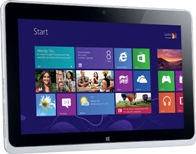
If you would like to see a preview of your current code, then you may use a HTML preview app. There are lots of these tools on websites. You may access one via your tablet web browser if you wish. Or, you could download an app that will do it for you.
Testing your HTML code
You may test elements of your HTML code via the preview apps. It will show you if buttons work of if widgets appear. You can test each element individually so that you get it perfect before moving on to testing the whole page at once.
Preview your whole web page
All you need to do is load the code for the page into the HTML previewing app. This will show you the whole page in its glory. You may see how each of your elements fits together, and you may see if your code actually works and does what you thought it would.
Debugging your pages with the HTML preview
Now that you have a preview of your page, it is time to start testing the various elements to see if they work correctly. You will also need to alter to the code and re-preview to be sure that the page is acting a certain way for the right reason.
An app to test dynamic websites
You then need an app that is going to help you test to see if your web page is dynamic. You should have programmed the web page to adapt to whatever browser it is being viewed by. There are apps that will let you test this coding. The will show you what the web page looks like on a phone, tablet and desktop computer. This will help to show you if your dynamic website worked.
Test the page with different browsers
You also want to know what the website looks when it is viewed through varying browsers. Knowing this will help you to decide if the website is stable and compatible with others. There are also apps that will allow you to test this browser problem, as there are also websites that will help you with this problem too.
Buy a domain name for your website
Now that you have your page file, you need to go and buy a domain. You do not need to download an app for this. Use the web browser on your Android, find a site that allows you to purchase a name, and then buy on.
Now you need to find a hosting service
Again, you can do this with your web browser. You do not need an app. Pick a hosting service and buy your web space and bandwidth. They should also offer you tools for loading your site and your domain name onto their server. If you are not sure of the process then make sure you buy from a host that will walk you through it.
And there you have it
You should be able to put your website online. You will also be able to use a similar process to build further pages onto your website, except that you will not have to purchase a domain name or hosting services. Just make sure to check your site for bugs after you have uploaded it.
About the Author:
Kate Funk is a passionate tech blogger and online tutor at tutorsville.net. She coaches individuals in writing and networking skills.
|
6/18/2013 | Continue Reading...
Is your website not apt for mobile visitors? Is it creating problems for such users? If so then better you get it fixed as soon as possible. With the increase in the usage of smartphones, the demand of mobile websites is going on increasing as well. In the near future, websites with mobile experience issues will not rank on a higher position in Google search results.
Experts say that if you have a bad mobile site, you will have fewer smartphone search ranking.
Recently, Google’s Yoshikiyo Kato and Pierre Far in one of their blog posts mentioned that:
To improve the search experience for smartphone users and address their pain points, we plan to roll out several ranking changes in the near future that address sites that are misconfigured for smartphone users.
To explain it further, they also shared two regular mobile configuration mistakes of several users and recommended these search ranking changes will help to bring in the smartphone search experience for Google users.

Faulty Redirects
The first issue is known as a “faulty” redirect, when a page listed in search may possibly redirect all smartphone users to the similar single mobile page, instead of a mobile-optimized version of the page the users are after.
Smartphone-Only Error
The second most common mistake witnessed is while trying to access a web page listed in search, get an error and nothing listed.
Optimizing For Mobile
According to Google, if you configure your mobile friendly pages accurately, it will definitely “improve the mobile web, make your users happy, and allow searchers to experience and experience your content fully.”
Well, if you wish your site to appear on all the platforms including smartphone and desktop then make it responsive. With the expansion in mobile Internet usage, the question arises that how to build websites appropriate for all users.
A responsive web design works on each device and in every screen size. No matter how large or big your system is whether it is a mobile phone or a laptop and desktop, one can browse just perfectly without any error. It focuses mainly on offering an instinctive and satisfying experience for everyone. Mobile phone user or any desktop user all can get benefit from a responsive website and it will also come in the list while searching on smartphones. Therefore, it supports SEO as well which let your website to rank on higher position.
These websites are mainly created for cell phones. Since these days, all business owners have understood the need of such responsive websites; they are heading towards it so as to reach the target audience. They have got its hidden potential and realized how it is changing their online business landscapes.
For businesses who think that being present in different online platforms is a bit tough, responsive websites are an ideal for them. It enables them to expand irrespective of the geographical boundaries and time constraints.
Most importantly, Google has always given more importance to responsively designed sites rather than others with significant content high page ranking.
About the Author:
Deepak Sharma is a digital marketing expert having immense knowledge in customized online technology that helps companies decrease costs and increase sales. You can follow Deepak on Google + and know more about him. This write-up throws light on “How the responsive websites and mobile website development will influence the search result in future.
|
6/17/2013 | Continue Reading...
Website design is very popular marketing business these days. It comprises of different skills and disciplines. It is needed for the production of websites and its maintenance. The company of web design offers various choices for transaction of money, online shopping, booking travel tickets, etc. Nowadays web designing can be described as a spectacular trend. Hence more or less there is an actual amount of compository matter. It usually affects the good side of the business. A person has to be aware for not missing any opportunity for the gain of the business. An important point which is to be taken care of in a web design company is that one’s hopes or strong beliefs should be fulfilled. The several areas of web design are interface design, authoring, proprietary software, user experience design standardized code and search engine optimization.

1) The quality of the online shopping advertisements is mostly showcased by the best web database developer. The developer does it creatively and visually by attracting the attention of the customers. These customers find for the proper data on the Web. Generally information has a specific quality. It is eliminated, edited and included continuously. Therefore it is vital for keeping down the web database secured. This further maintains the consistency of the information.
2) Regarding the case of online shopping, where numerous people gathered around. Moreover the business associates had to produce large quantities of the data needed of the products. It is then presented to their respected customers who urge for correct information. They do it in an accurate and greatly technological technique.
3) Website design and development has huge amount of data and prospective results were provided by search engines. The process was however pretty quick. The most important task of a web database developer is creating the information to be simple and understandable. Moreover it should catch the attention of the mass by providing the specific information as needed.
4) Although the gradual transformation which took place over the masterminds of web database development was brought in full control. The usage of information was readily available in clean and tidy packages. It was usually provided to a person for the commercial business. The customers are provided commercial upbringings along with web database development. These upbringings had efficient method for reaching information.
5) A thorough research for the topic is necessary for cross checking the web design company. Generally the web designers made a mark fro being up-to-date along with the web accessibility rules. Moreover having the knowledge of the utility of the website.
Certain vital prospects are required while making web database which enables in designing or making the specific database. It should have the facility of eliminating of the data only whenever essential. It should also not comprise of any copied written references or accounts. Moreover it should enable in referring other information with the database in a simple and easy procedure. However these prospects should be kept in the mind of the best web database developer.
Visual impact is one of the most important element is marketing. The website design and development has become popular by offering the visual impact in online marketing.
|
6/05/2013 | Continue Reading...


